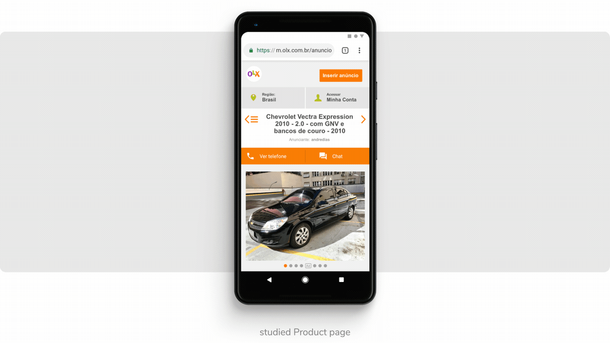
OLX is an online P2P marketplace with over 9 million items listed across 12 unique categories. This diversity demands versatile product pages to accommodate the wide range of items sold by its users.
At the time, the platform was receiving over 48 million daily views, and the mobile site’s listed product page ranked as the second most visited, which led the Content Discovery team to prioritize its redesign.
Our objective was to craft a product page versatile enough to suit all categories, while also allowing for category-specific customizations.
Initial Insights
User interviews and usability tests revealed several shortcomings in the previous product page, negatively impacting user experience:
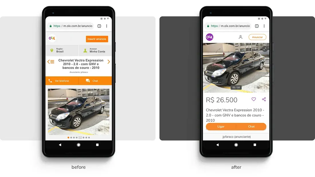
- The product’s images and price were undervalued.
- Users couldn’t enlarge images.
- The ad’s attributes, provided by sellers, lacked prominence.
- Critical call-to-action buttons for contacting sellers were overlooked.
Redesign Process
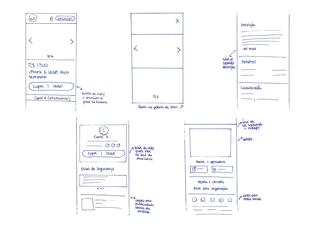
We identified these issues and sought solutions by reviewing various design options, drawing inspiration from market competitors. This led to preliminary sketches that laid the groundwork for collaborative sessions with team members from different departments.
Prototyping and Testing
Following these collaborative sessions, we incorporated feedback and created a high-fidelity prototype (using Principle) for user testing. Our aim was to gauge user understanding of the proposed visual and textual components.
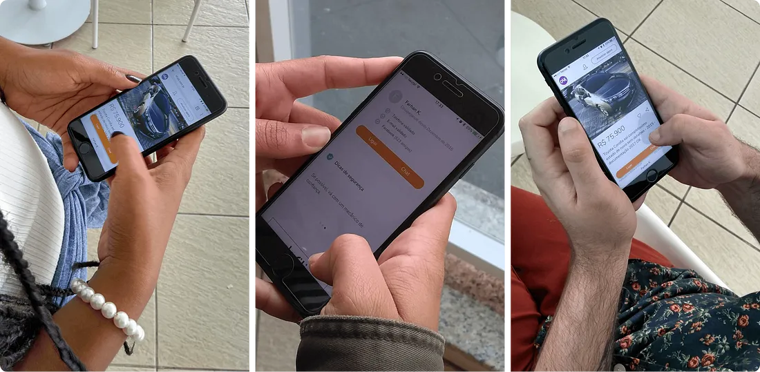
User testing highlighted several areas for improvement:
- Adding a “Seller” label at the screen’s bottom to make this information more noticeable.
- Changing the phrase “Letting it go since December 2016” to “In OLX since December 2016” to clarify that the date referenced the seller’s OLX usage, not the ad’s posting date.
Final Enhancements
All interface modifications aimed to improve information accessibility and support user decision-making.
-
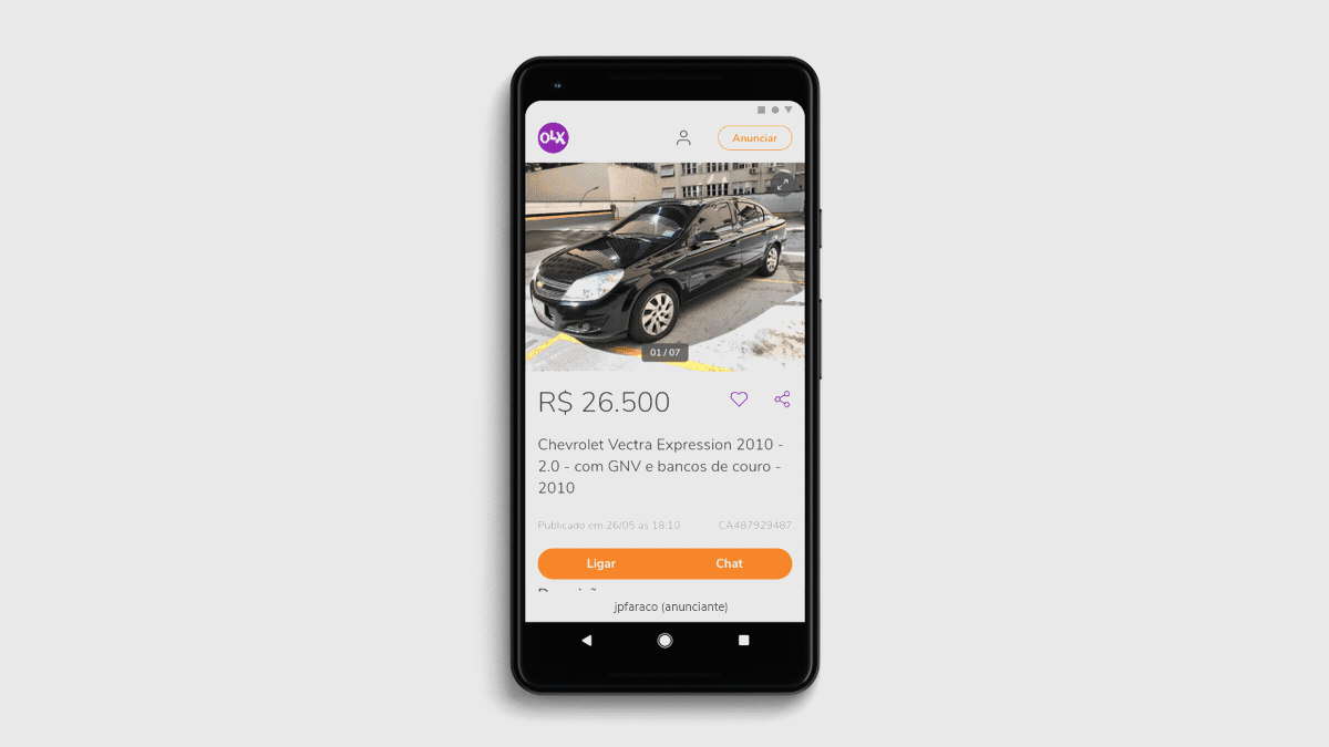
Highlighting images and price: Recognizing the crucial role of a product’s images and price in decision-making, we enhanced their prominence on the page.
-
Image gallery enhancement: Understanding the importance of detailed product visuals, we introduced a feature to enlarge images, enabling users to closely inspect products before contacting the seller.
-
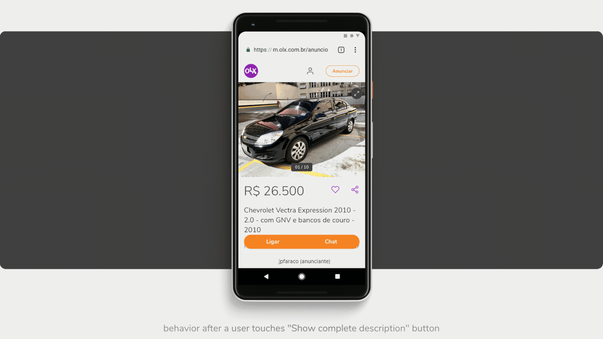
Concise product descriptions: Seller-provided product descriptions, capped at 6000 characters, were causing essential ad attributes to be overlooked. To address this, we limited visible descriptions to three lines, adding a “Show complete description” button for full access.
-
Accessible contact buttons: We positioned contact buttons for sellers in the smartphone’s thumb zone, ensuring they remain accessible while browsing product pages.
-
Seller profile integration: Incorporating a new seller profile section, developed by another team, provided additional seller details and tailored safety tips based on product category.
Outcomes
The revamped product page became accessible to all mobile users of OLX.
These interface and information architecture improvements led to a 6.5% increase in seller contacts and a 4.5% rise in listing visits on the platform.
👯️ Team
- Lead Product Designer: João Faraco
- Senior Product Designer: André Dias
- UX Researcher: Alice Wanderley
- Product Manager: Thays Macedo
- Developers: Guilherme Bomfim, Vitor Pinto, Thiago Klein