I recently came across Kent Sullivan’s 1996 case study on the design of the Windows 95 user interface, and reading it felt like finding a letter from a more civilized era. Sullivan joined the Windows 95 UI team in 1992 and spent years documenting how the team ran the redesign of the most widely used operating system in the world.
The paper describes iterative prototyping, lab testing with real users, formal problem tracking databases, field studies. It describes about twelve people (product designers, graphic designers, usability testers, computer scientists) working together to make Windows easier to use for people. That was the goal, and there was no other one.
In the whole paper there is not a single line about engagement metrics. There are no dark patterns to trick users into enabling telemetry, no notification spam, no sneaky conversion of local accounts into cloud-dependent ones, no “AI” buttons bolted onto every surface. Just people watching other people use a computer, taking notes and going back to fix what was broken. Reading it today, the whole thing feels almost quaint.
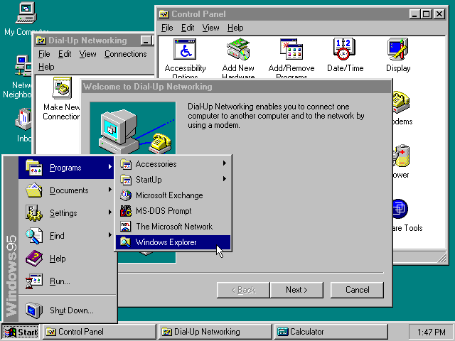
The process that built the Start button
What impresses me most in this account is the rigor. The team didn’t guess at solutions; they measured the problems first. They identified the twenty tasks users performed most often on Windows 3.1 and ran lab studies comparing how people handled those same tasks on the old system and on the new one.
The early results were bad. Instead of panicking, the team held an offsite and went back over everything they had collected so far: baseline studies, interviews, market research, product support calls. The conclusion would terrify most product managers today. A truly usable system might not look or act like Windows 3.1 at all.
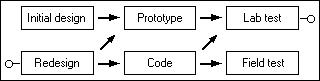
The taskbar is maybe the best example of that process in action. The team’s first attempt at improving window management was modest. They changed minimized windows from small icons to larger “tiles,” hoping that bigger targets would be easier to find. It didn’t work, and users had the same problems as before.
The real issue, the data showed, was that windows weren’t always visible, and people couldn’t tell what was open or switch quickly between tasks. So the team came up with the persistent taskbar, one button per running application, always on screen and always accessible. They tested it, it worked, and it shipped.
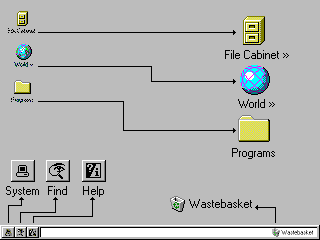
And no committee of VPs debated whether that bar could also serve ads or suggest Bing searches. It was there to solve a user problem.
By the end of the project the team had logged hundreds of usability issues in a formal database, resolved 81% of them, partially fixed 8% and left 11% open, usually because of technical limitations rather than lack of interest. For that team, getting it wrong on the first try was worth as much as getting it right, and you can see that in the outcome, because literally nothing from the original UI design made it into the final product unchanged. Everything was iterated, tested and reworked.

How affordances were stripped away
Windows 95’s interface established a visual language that an entire generation internalized without realizing it. Buttons had bevels and shadows, so they looked like things you could press, and disabled controls were grayed out. Menu items with ellipses told you a dialog was coming, while items without them executed immediately. The underlined letter on every label was the keyboard shortcut. The affordances were everywhere, consistent, and self-documenting.
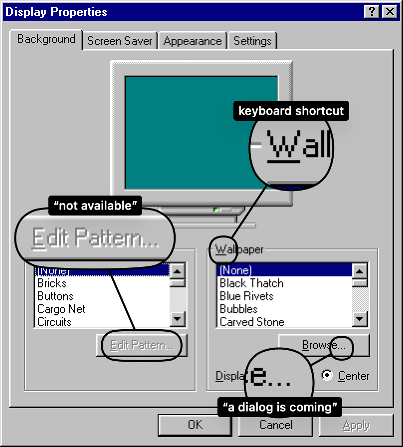
That generation grew up and became designers. And because they had been raised in an environment where interactivity was obvious, they assumed it was inherent.
Of course you know that thing is a button. It is a button, so why does it need to look like one?
Then the affordances were stripped away, widget by widget, bevel by bevel. Gradients replaced outlines, explanatory text disappeared, and manuals became brochures and then a slip of paper with a URL. Flat design arrived and declared that all visual cues were clutter, and what replaced them was elegance, the kind of elegance that makes a screenshot look gorgeous in a keynote, but leaves actual humans tapping around a glass surface hoping something will happen.
Apple’s Force Touch is maybe the peak example of that, a feature where pressing harder on the screen does something different from pressing softly. How would anyone discover it on their own? Right-click on Windows 95 had a similar discoverability problem in theory, but in practice having a second physical button on the mouse, right there next to the first one, made it far easier to stumble upon. Force Touch, on the other hand, was a ghost interaction.
iOS hid the scrollbar. Then it hid the tab bar at the bottom of Safari, and you have to scroll up to make it reappear. People report scrolling all the way to the top of a page just to reach the navigation, with no idea there is a hidden bar below. Scrolling and navigation are about as core as interactions get, and they ended up invisible for the sake of visual cleanliness.
Optimized for the company, not the user
The paper describes a team that optimized for the user. Today, most interface decisions are optimized for the company’s bottom line. Put that way, it sounds like a small difference, but in practice it is enormous.
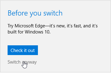
Modern Windows nags you about switching browsers, sneaks advertisements into the Start menu, pesters you to create a Microsoft account and then makes it almost impossible to use a local one. Try setting up a fresh Windows 11 install without an internet connection, and the OS will fight you at every step.
Settings are scattered across two different interfaces, the legacy Control Panel and the newer Settings app, as if the team got halfway through a migration and then got reassigned.
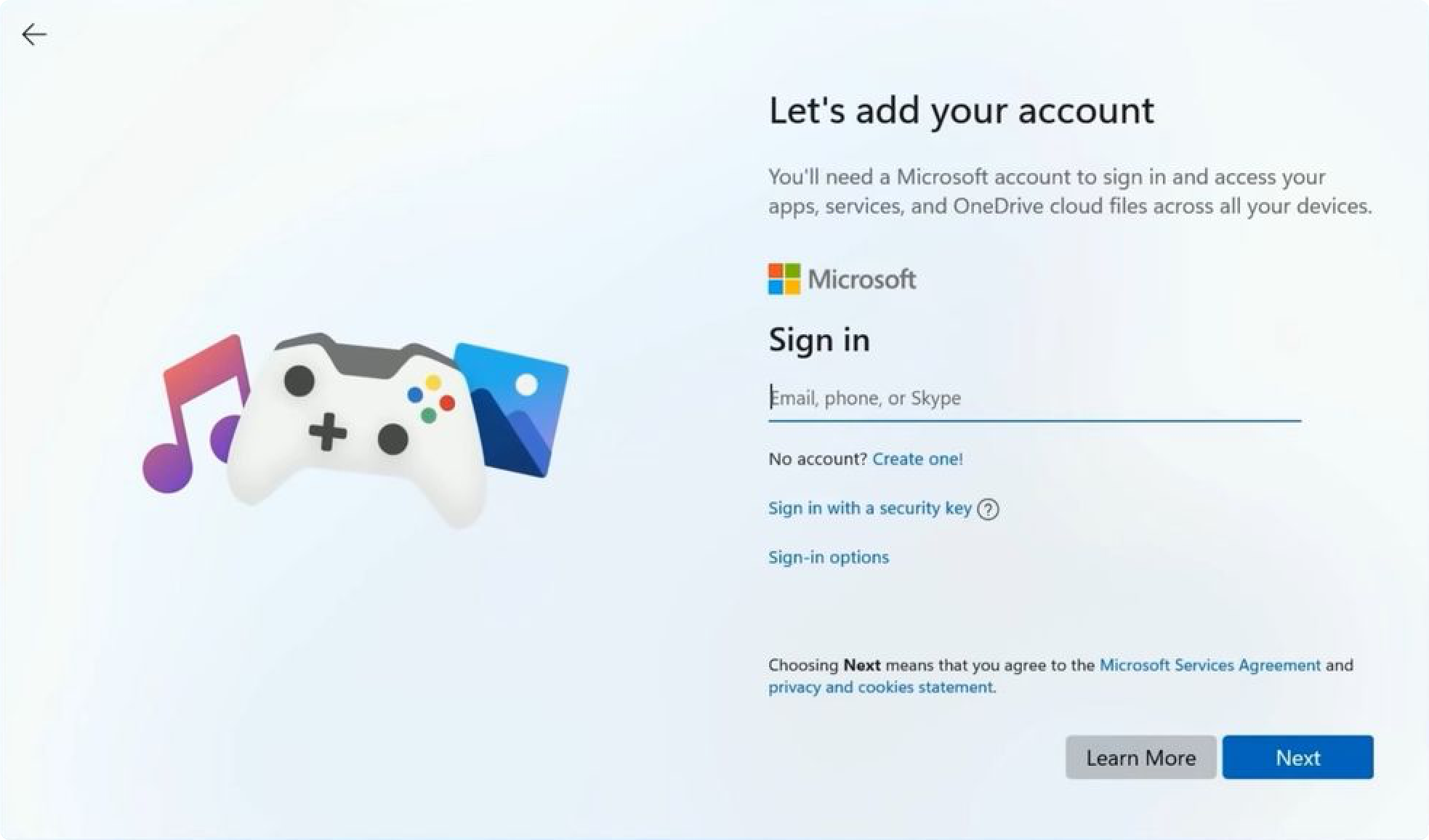
Calling this incompetence would be too easy. The effort is still there, pointed somewhere else.
When Kent Sullivan’s team found that printer setup was confusing, they built a wizard to walk users through it step by step. When modern Windows finds that users prefer Chrome, it adds one more confirmation dialog to discourage anyone trying to leave Edge.
The same drift happened across the whole industry, and every major OS now has some flavor of dark pattern: opt-out data collection, deliberately confusing privacy settings, notifications designed to create anxiety rather than inform. I read a comment somewhere that stuck with me, to the effect that the UIs of the late 90s were the last ones designed by people who actually cared, by people who approached the process with the end user in mind. I can’t vouch for it as a rule, but it matches what I see. Those interfaces were optimized for the user. These are optimized for the company.
Death of the consistent interface
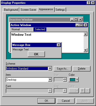
One thing from the Windows 95 era that I miss and that rarely gets discussed is system-wide theming. You changed the color of every single UI element (title bars, buttons, text, backgrounds) and any properly written application respected your choice.
Wanted dark mode in 1995? You had it, and you could go all the way down to the color of each individual widget.
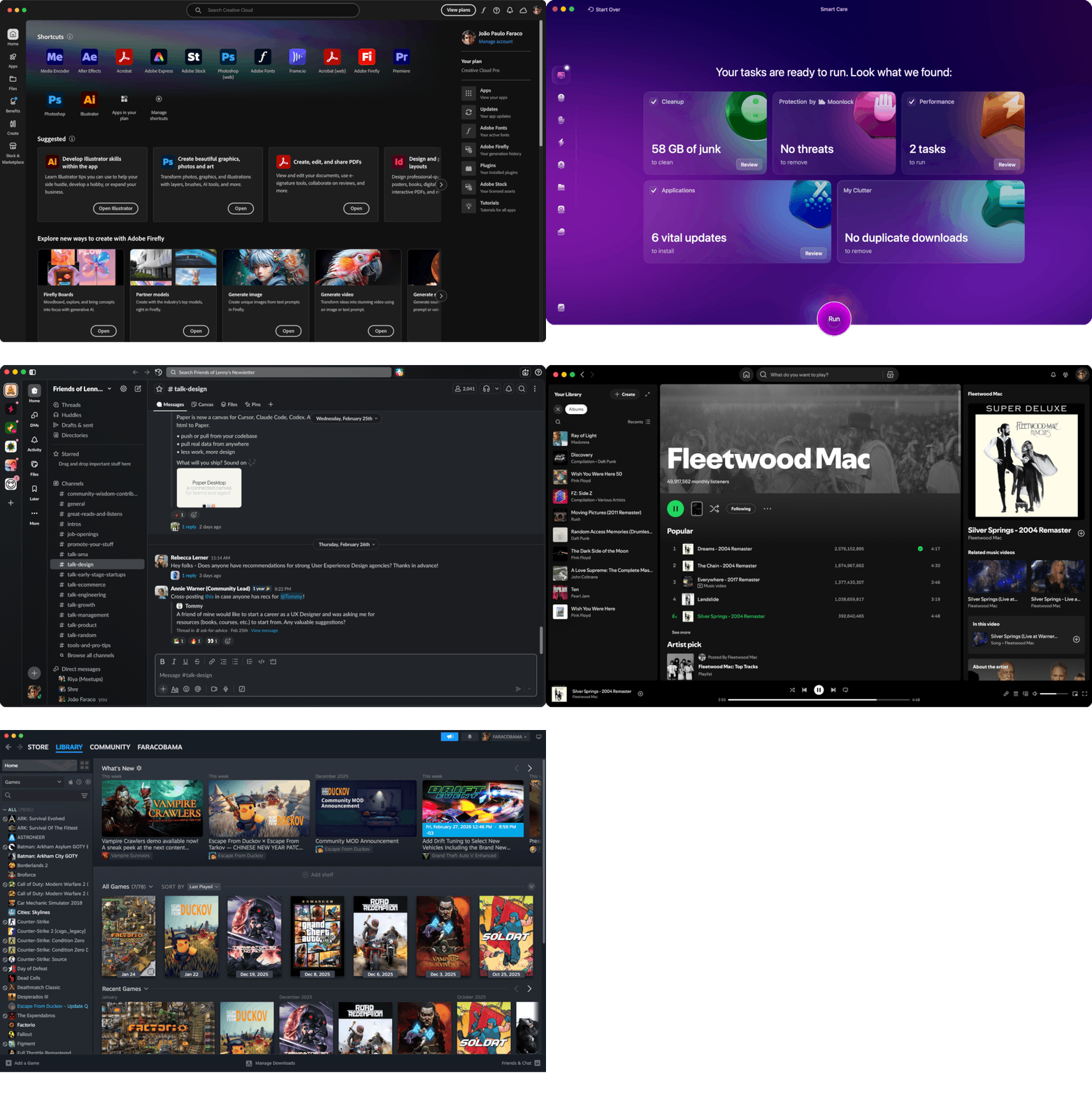
Now, after years of watching developers abandon native controls to draw their own interfaces, we get “dark mode” announced with fanfare, as if it were some breakthrough feature. And half the apps don’t even respect it. Spotify looks like Spotify regardless of what your system theme says. Discord does its own thing, and so on. Every Electron app is an island that ignores the host OS’s conventions, its accessibility features and its keyboard shortcuts. What you get instead of a coherent computing experience is a dozen design languages crammed onto one screen, each one broken in its own way.
Back when applications used the OS’s native UI toolkit, a theme change rippled through everything, and if an app didn’t respect your colors, that was a bug. Today the concept doesn’t even exist, and you get whatever the designer’s Figma file decided three sprints ago.
And the loss goes beyond aesthetics. Native controls meant that keyboard shortcuts, tab order and the behavior of text fields and scroll areas stayed consistent everywhere. Screen readers and accessibility tools could hook into the OS’s control hierarchy. When every app draws its own UI from scratch on a web canvas, all of that breaks.
We also got faster hardware and slower interfaces
The most absurd regression is probably responsiveness. Windows 95 ran on machines with 8 MB of RAM and responded to clicks almost instantly, because the UI code was written at a very low level, tightly coupled with the OS itself. Today Photoshop’s “New” dialog takes seconds to appear, Slack can use gigabytes of RAM to display what is, functionally, a chat window, and some applications take longer to respond to a button click than it takes light to travel around the entire planet.
We got machines thousands of times more powerful and spent that headroom on convenience for the people building the software, not on speed. Electron wraps an entire Chrome browser instance around what could be a lightweight native app, and React re-renders entire component trees to update a single line of text. The cost lands on the user, in latency, in battery drain and in that constant low-grade frustration of interfaces that feel sluggish for no visible reason.
You can reasonably argue that part of this is an acceptable tradeoff, since web technologies lowered the barrier to building cross-platform apps and plenty of useful tools that exist today would never have been built otherwise. Fair enough. I just think it is worth acknowledging that the tradeoff exists, and that the user is the one paying for it.
What’s actually worth taking from 1995
I don’t think nostalgia is the right response here. Don’t get me wrong, Windows 95 had plenty of problems: flaky stability, terrible multitasking under load, an install process that could ruin your afternoon. What was better back then was the process.
The Windows 95 team practiced what we now call continuous discovery. They watched real people do real tasks, identified the pain points from the data, prototyped solutions and tested them again. When something didn’t work, nobody sat around arguing whose instinct was right; they ran another study. And they maintained a tracking database of usability problems the same way we maintain bug trackers for code.
As someone who works in product design, I find this inspiring and a little depressing. We have analytics, session recordings, A/B testing platforms, remote usability tools. We have never had so many research tools available, and still the dominant design trend of the past decade has been to prioritize visual minimalism and engagement metrics over the kind of painstaking, user-centered work Sullivan’s paper describes.
The best design teams I have worked with still do some version of it, but they are swimming against a current that rewards shipping fast and measuring clicks. The Windows 95 case study is a reminder that there was another way to work – slower, more disciplined, considerably more respectful of the people on the other side of the screen. I think we should read it more often.