A few years ago I was in the middle of refactoring Memed’s design system when a branding agency delivered our refreshed palette. The timing looked perfect – new colors for a new system.
The brand colors they gave us were great for the logo and the marketing materials. That’s what they were designed for. But a prescription platform UI needs a lot more than four or five brand colors. We needed tints for backgrounds, shades for depth, and a bunch of midtones for the interactive states. Around ten steps per color. The agency’s palette didn’t come with any of that, and why would it? Brand guidelines focus on the core identity, not on every detail of an interface.
So it fell to us to “unfold” those brand colors into full ramps. I started in Google Sheets, scotch taping together some Apps Script to convert between color models and plot the hue, saturation, and brightness channels for our ramps…
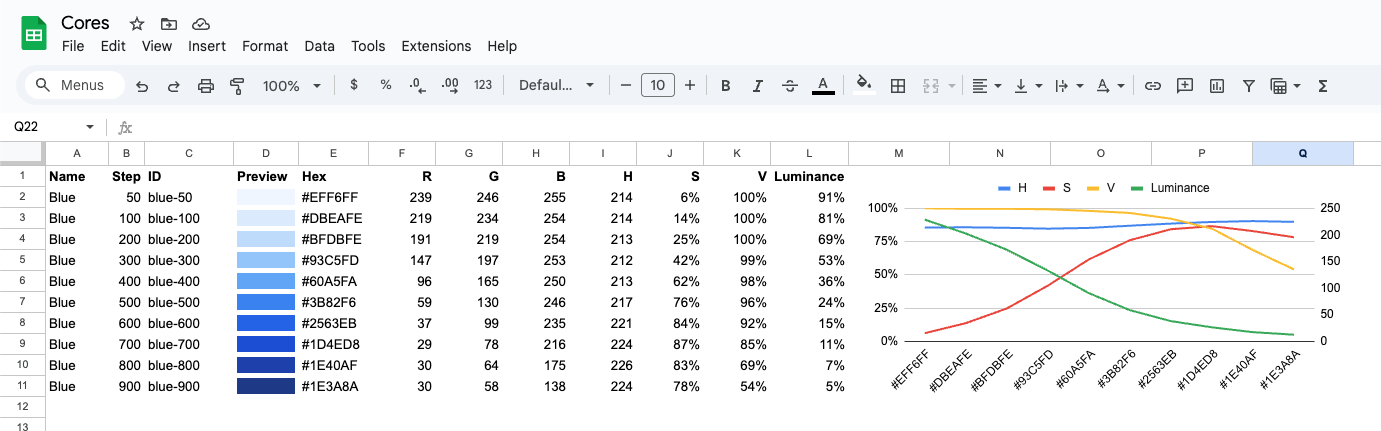
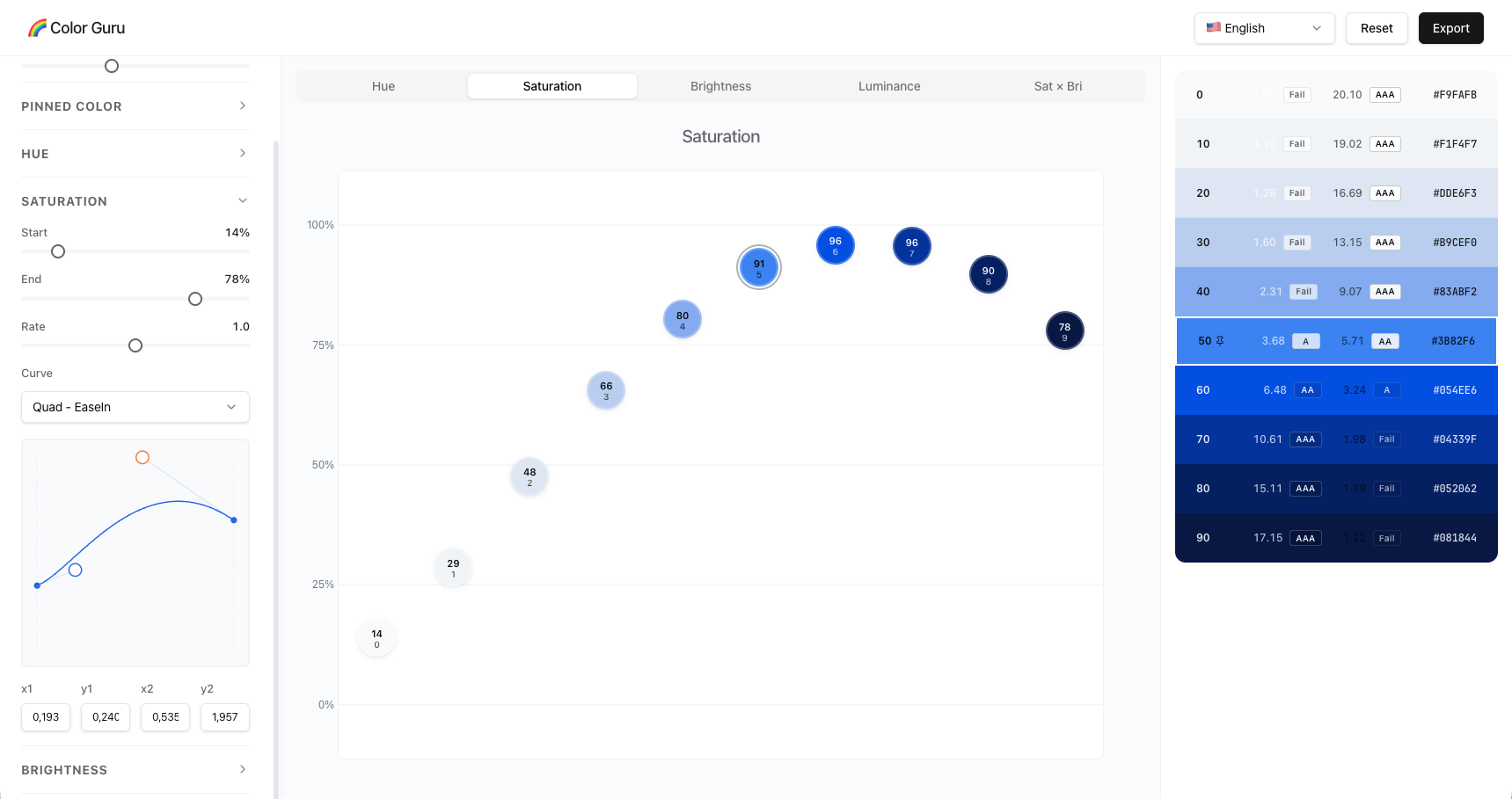
It worked, and I’m not proud of it. But now that coding LLMs are good enough to help build real tools, I decided to turn that pile of hacks into something I’d enjoy using. That’s how Color Guru started: a way to design color ramps by shaping curves instead of picking hex codes one at a time.
Thinking in curves
In UI, you usually want more steps at the extremes than in the middle. The very light shades give you subtle backgrounds, and the very dark ones give you depth. The middle range is where you need stronger contrast, because that’s where the text and the buttons sit. Which means a luminance curve that’s steeper in the middle and flatter at the ends.
Bézier curves were exactly what I needed, since you can describe that shape once and generate as many steps as you want from it. And we already use Bézier curves all the time for animation easing, so we’re used to them.
Building on ColorBox
I definitely wasn’t the first person to think about color ramps this way. Kevyn Arnott’s ColorBox v1 was a great curve-driven color ramp tool, and I used it for a while. So why build another one? Because there were three things I kept wanting that it didn’t have.
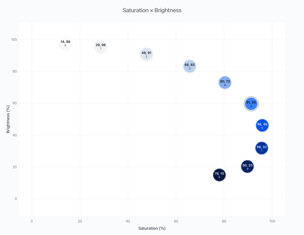
First, I wanted to see saturation and brightness together, not as two separate line graphs. When you plot one against the other, you spot problems you’d completely miss otherwise: light colors that suddenly lose all their saturation and turn chalky, and dark colors that get too intense and go neon. That Sat×Bri plot is the diagnostic view I wish I’d had back at Memed.
Second, I wanted fine control over the shape of the curves. ColorBox lets you see the curves, which is huge. But I wanted to nudge just the light end, or stretch out the middle, or pack more contrast into the darks, each one independently. That is exactly what cubic Bézier curves with individual control points let you do.
Third, I needed a way to pin brand colors. Back to the Memed refresh: the agency gave us specific hex codes, and I had to build an entire systematic palette around them. Trying to reverse-engineer curve settings to land on an exact hex code was impossible. Now you can type the hex code in or click a color in the preview, and Color Guru slots it into the ramp by luminance, and you shape the rest around it.
How I actually use it
When I’m putting together a new palette, whether it’s a primary color, the neutrals, or the status colors, it usually goes like this:
-
I pick how many steps I need. There’s no right answer here, but ten to twelve works well for most design systems.
-
If there’s a brand color coming from the guidelines, I pin it before anything else, and shape the curves around it, with the pinned color staying put while everything else moves.
-
Then I go after luminance. I try to stay around 4-6% luminance at the darkest shade and 95% at the lightest. The trick is giving the middle enough room for strong contrast and leaving the ends with at least 3 tones varying slightly (borders, backgrounds, hover states, that sort of thing).
-
Next comes the saturation curve. I ease it down toward the light end, but not so far that the tints go chalky, and push it up through the darks so they don’t turn muddy. I almost always land on a convex curve that peaks around 70% of the way through the ramp and then eases off toward the very darkest shades. That’s my taste talking.
-
A tiny bit of hue drift (optional). Remember that some colors carry more luminance than others, and you can use that to your advantage. A generally blue ramp, for example, can have its light tones leaning cyan and its dark tones leaning purple. Erik D. Kennedy covers this well in his article Color in UI Design: A (Practical) Framework.
-
I look at the Sat×Bri plot. If the arc is smooth, I’m good. If there’s a kink or the line doubles back on itself, something is off, and I go back to adjust saturation and brightness. Jeeyoung Jung goes deep on this in his article Designing Systematic Colors.
-
I check the contrast. The tool shows the contrast ratios in real time, so I can see right away which combinations hit 4.5:1 for body text and 3:1 for large text and UI elements. That way I settle accessibility while I’m still drawing the palette, instead of discovering problems later.
Once I’m happy with it, I export to Figma and test it on a few components. If it all looks fine, I can also export it as CSS variables, JSON, or plain text.
Try it out
The tool is live at colorguru.design, and the source is on GitHub. If you find it useful and want to contribute, I’d love that.
Note: I used AI to help structure and refine this post.