I wrote this essay during my postgraduate studies in Ergonomics and Human-Computer Interaction at PUC-RJ in 2009. Although it is quite dated, I still find the concepts interesting, and with a certain historical value.

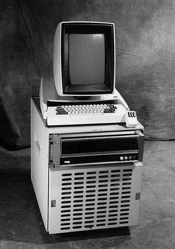
Xerox Alto. A vertical rectangular monitor, analogous to the sheet of paper its users were accustomed to working with.
The computer was invented as a tool to facilitate certain tasks, much like the can opener and the hammer. The difference is that, being a mathematically based and almost abstract tool, it can take on infinite forms. A computer can be a simple calculator, or a musical instrument. It can actually be whatever we want, as long as we can relate to its structure, to give the necessary instructions so that the task can be carried out as we wish.
Starting Point
In the beginning, this relationship was quite hermetic, occurring only among enthusiasts willing to learn how to mold the tool to their needs. As long as they knew how the machine worked, users had the freedom of the mind to create what they could with the physical interface available to them. Ted Nelson criticizes in his text Way out of the box the fact that companies and individuals who were interested in massifying the use of computers did so in an imprisoning way, and simply replaced the freedom to program with the ease that more people would have to use tools created by programmers.
This process established a series of conventions that today have become invisible and obvious, but that could be different if we consider the potential of functionalities that exist in computers. He cites the example of the desktop metaphor, which was created to facilitate the use of computers for Xerox employees, who worked with paper all day, and needed an analogy that concretized that novelty. This model, therefore, did not change when the computer reached the hands of artists, for example. What does an artist do in their day-to-day that involves workspace, files, and folders? If an artist’s interface needs to be a metaphor of their world, this requires that the elements be adapted to what they are used to interacting with every day: paint, clay, pens, peculiarities of materials, textures, etc. However, the interface model already existed, was being used, and, above all, worked to help the user operate the computer as just another tool. The most adaptation that occurred was a simple makeover, made possible by the advancement of technology and the emergence of computers that could support more sophisticated graphic resources.
And why, for example, did artists not adapt the system presented to them, to their own profile? The system served as a starting point. Everyone who had not had contact with a computer before had their first relationship following the rules that already existed, and adapted to them as if it were the only one. Any discomfort was ignored, and the new user got used to the irregularities of the imposed system, adapting to it, precisely to have somewhere to start.
Although it may seem wrong, a common starting point was necessary so that something could be developed on top of it, by the new mass of computer users. This starting point was the factor that made the structure and operation of the computer tangible for those who had never had contact with something so abstract.
Evolving from the Essential to the Superficial
As soon as the mode of operation of computers was massified, more people were able to explore it to create new functionalities.
However, everything has its rhythm. Nelson describes in his text that his original hypertext project, Xanadu was ignored at the time (1965) for being too far from the interface and information representation standards of the time. The moment he simplified and adapted the project to what people were more accustomed to, they identified with it and took the idea forward, to create the next step that would be the Web.
If we told people today about an environment composed of pages that contain links to other pages, and reading is done in a non-linear manner, they would not be very impressed. Although it was an innovative concept in the book era, in the Web era it has become standard, and everyone has incorporated the idea. A sign that we need to move on to the next step in the evolution of representative interfaces.
This evolution is constant. A recent example is the so-called Web 2.0, where sites are the product of interaction among users themselves and the content is malleable and generated by those who access it. This model is also becoming standard when talking about internet content, but for it to work, it needed people to get used to the simple and harsh Web 1.0. Having been built on the same foundation of hypertext, Web 2.0 is a natural evolution that occurred as users became accustomed to the model and demanded new functionalities for what they wanted.
Users saw that they could search for information with the internet. Having done that, they needed a parallel channel, to allow for the exchange of information. It is this rule of demand that makes everyone designers of the world with which they interact.
Another example of how this natural evolution quickly occurs on demand was the invention of drop-down menus. Bill Atkinson describes in Designing Interactions, how the whole idea of hiding items and displaying them by passing the mouse over was conceived in a single night. The need led him to develop the system quickly, without needing to take advantage of concrete models and metaphorize them. And if there had been no platform upon which he felt this need, he would not have developed the drop-down system.
We see then why Nelson’s project seemed a step too far. For him, Xanadu was his ideal model. But that’s because he was already well familiarized with what already existed before, unlike most, who found his idea delirious. Just as if someone had presented the concept of Second Life to people before there was a solid model of interaction between users in an online environment, few would be able to adapt, or even understand. Xanadu was the superficial trying to arrive before the essential.

Information navigation is not limited to two-dimensional pages, in Second Life.
Returning to the example of the artist who adapted to the new tool, simply to start using it, the computer today has already become part of the day-to-day of creative professionals. And although we use it under the same metaphorical model of a cold and distant office, the habit and familiarity with such a system allows us to modify it for our benefit.
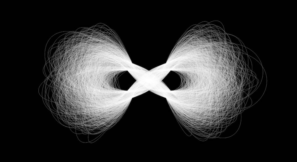
Ellen Lupton displays in New Fundamentals of Design, a gallery of works created using only code. The pieces were not created using an application with pre-defined tools, but rather from rules defined by algorithms written by the students of the Media Lab, at MIT. We take advantage of what we have at the essential level and use the system so that it serves us in a more personal way. And the more personal the level of interaction, the more pleasure we can derive from the activity.

Image created by John Maeda, using the programming language Processing.
An example of this are 3D modeling applications. Initially used to assist architects, engineers, and product designers, the operational processes of the programs followed the need of their users: precision. Models were constructed by manipulating points and vertices to create volume. Having seen the potential of these applications, other branches of creation decided to adapt to the existing system and create their own works on top of it. These were professionals from the traditional field adapting to the digital workflow process.
But the tool was still not ideal. Polygonal modeling does not provide the same freedom, the same rhythm that freeform modeling carries. Gradually, CAD programs were adapted to the workflow of sculptors, to approximate what they were already accustomed to: shaping blocks through manual actions in direct contact with the material. We can see a clear adaptation of the tool to the user if we observe the product line that was being released. AutoCAD (1982), 3DS Max (1990), ZBrush (2002).
And what would be the next step, while the computer does not match the real experience, but with its own advantages?
Returning to Hardware
As interfaces become more personal, intuitive, and consequently invisible, we start to question whether the hardware we use is ideal for carrying out the task. Why do we use a device similar to a soap bar to perform the task of a pen? Why do we sculpt something in 3D, but see the result on a flat surface? It does not seem to be ideal. So we start to worry about using the hardware that brings the sensation that there is nothing between us and our work.

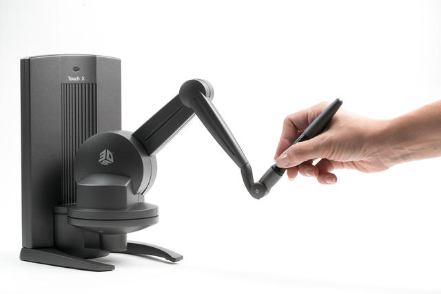
Haptic pen Touch X
Some examples are clear, like the tablet, with pressure sensors, tilt and direction of the pen, to mimic the result of a pencil, but with the advantage of serving as any other tool we hold between our fingers. Or even the sculpting arm Touch X, which sensitizes the act of truly sculpting in a three-dimensional space, returning pressure forces based on the movement against the virtual clay.
Output devices also affect the optimization of the work experience. Virtual reality helmets, 3D glasses, and holograms are a step forward for those working with 3D modeling or environment design.
Science fiction movies are an experimentation field for what the mind requires to adapt systems to man’s need. In the movie Iron Man, the character Tony Stark fully masters the tools with which he works, enabling him to create the ones he needs to assemble his armor in the most efficient way possible. The interface with which he projects his ideas is optimized by himself, according to his own needs, so that only he can take advantage of it, making his work enjoyable and effective, and returning results at the speed of thought.
Contents: