The problem
Every month, condo managers in Brazil receive a dense PDF or Excel file summarizing the building’s finances. It covers everything from maintenance contracts to utility bills — but it’s structured for accounting, not for understanding.
As a resident, I found it genuinely difficult to answer basic questions: Where did the money go this month? Which expenses are growing over time? Is that vendor charging us consistently? The data was there, but buried under accounting codes and technical jargon.
After talking with residents and managers across two buildings in Rio de Janeiro, it was clear this wasn’t just my frustration — it was a structural gap in how condominiums communicate financial health to residents.
Working with design partners
I reached out to two condominiums with different profiles — one mid-size residential building in Botafogo, and a larger complex in Barra da Tijuca — to validate the concept and co-design the product.
Through interviews and working sessions with building managers and treasurer committees, two root causes stood out:
1. Data was locked inside proprietary systems. Managers ran their accounting in a legacy property management tool that could only export CSV files. Nothing could import those files and produce meaningful charts.
2. Transaction descriptions were cryptic accounting codes. A payment listed as “SERV MANUT PRED 04/12” meant something specific to the accountant, but nothing to anyone else. Residents and committees had no way to identify where money was actually going.
This shaped the core product bet: import raw data from existing tools, enrich it with plain-language categories using AI, and surface insights through visualization.
Jobs to be done
Understand the month at a glance
income, expenses, change from last month
Spot trends over time
which categories are growing, which vendors keep recurring
Drill into any area
from an accounting group down to a single transaction
Spot anomalies
identify one-off charges and vendors that didn't appear last month
These mapped directly to the four main views. The sunburst drill-down, for example, started as a secondary view and became the centrepiece of the app after pilot sessions showed it was where users spent most of their time exploring.
Designing the platform
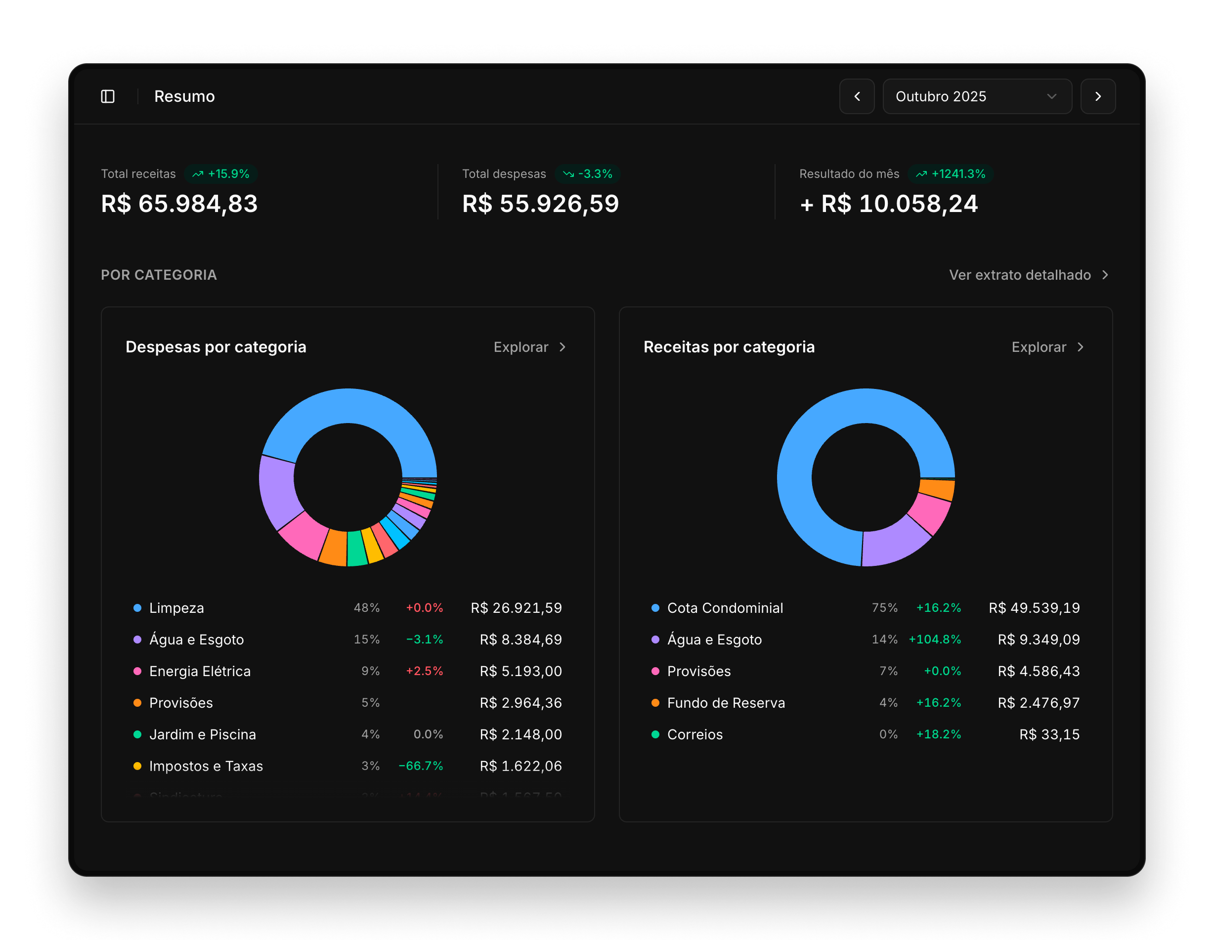
Monthly snapshot
The first thing a user sees after selecting a period is the Resumo (summary). It answers the most essential questions immediately: how much came in, how much went out, and how does that compare to last month?
The two pie charts break down income and expenses by category. Beyond the quick read, they also serve as an entry point to explore categories and their details for that month.
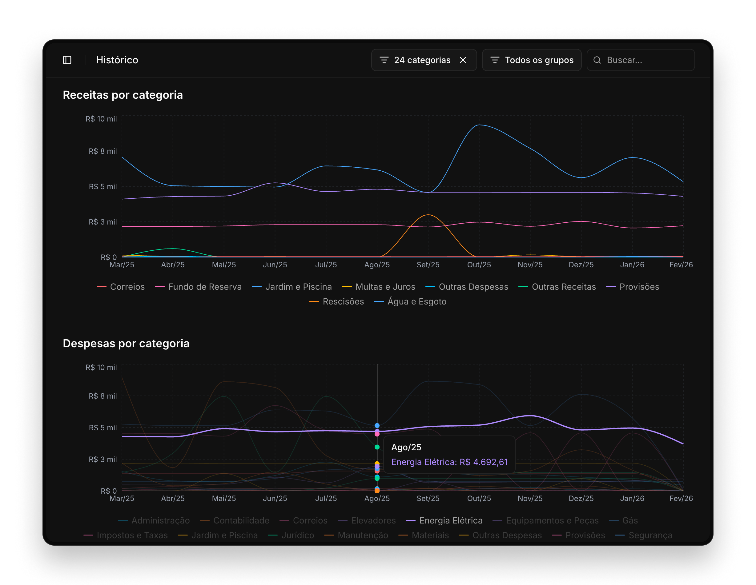
Trends over time
The Histórico (history) page lets users track financial patterns across months. Four time-series charts cover income vs. expenses, income by category, expenses by category, and the closing balance by accounting group.
Hovering a line on the category charts removes the clutter and helps to focus on a specific category.
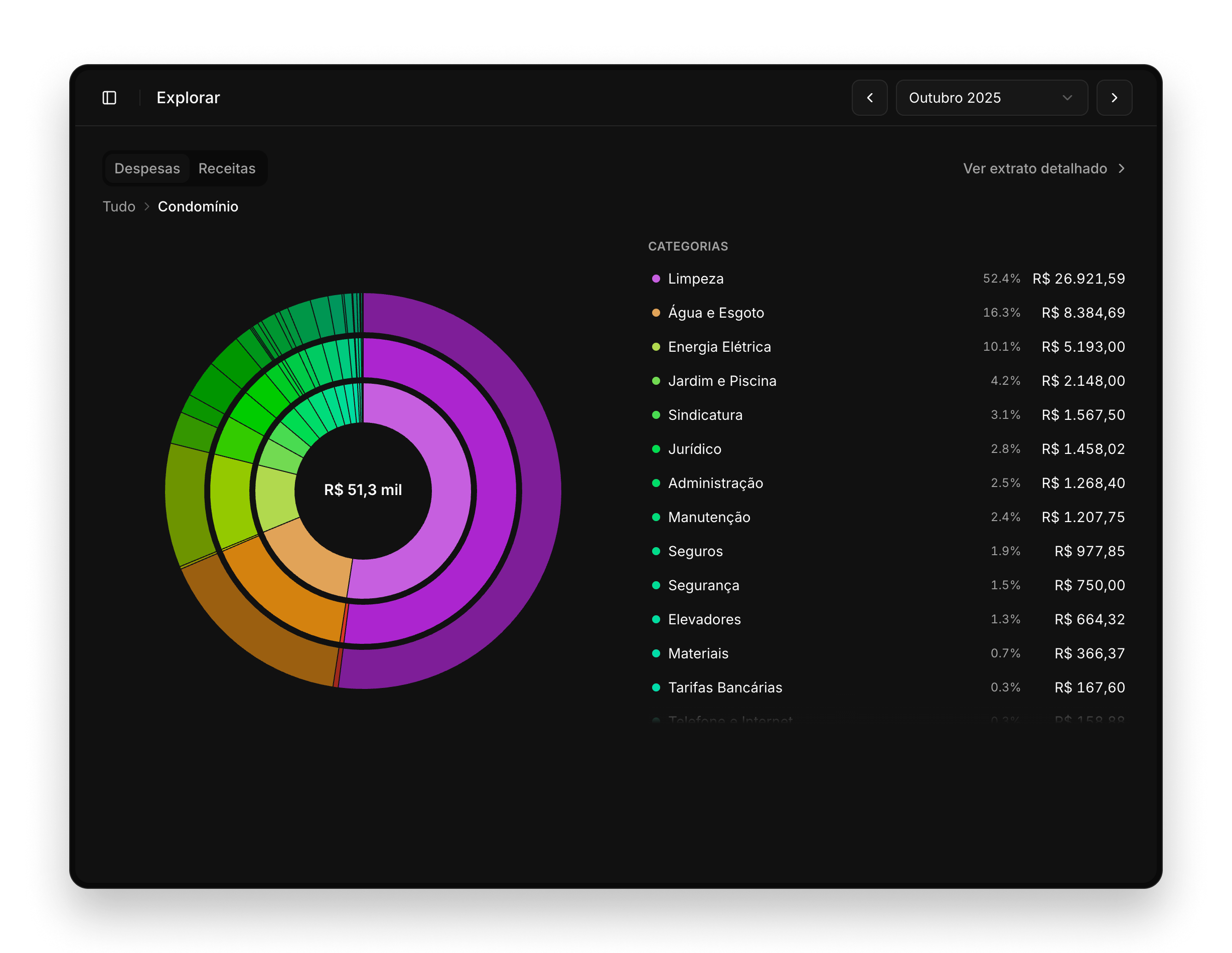
Visually exploring the data
The Explorar (explore) page was the feature that excited pilot users the most. A large interactive sunburst chart lets anyone navigate from the top level (accounting groups) all the way down to individual transactions. Clicking any arc zooms in; clicking the center zooms back out.
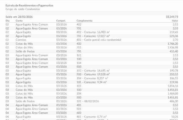
Statement detail view
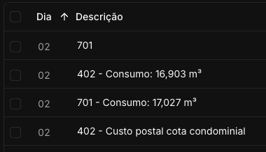
For those who need to inspect individual entries, the Extrato (statement) page renders a full transaction list with sortable columns, category filters, and free-text search. Each row is enriched with a normalized category and vendor name.
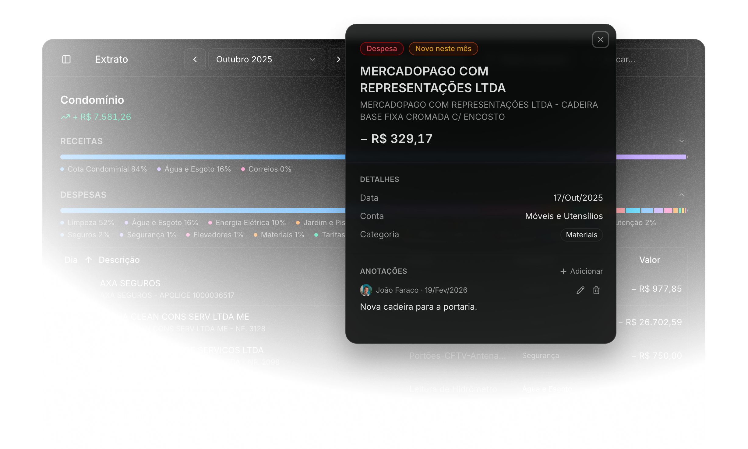
Selecting any text in the table allows a search by that value, instantly filtering the list to matching rows. It’s a small microinteraction, but it makes cross-referencing entries much faster than typing.
Enriching data with AI
CSV exports from condo management systems carry terse, accounting-style descriptions. To surface meaningful categories and vendor names, I built an enrichment pipeline using the Groq API.
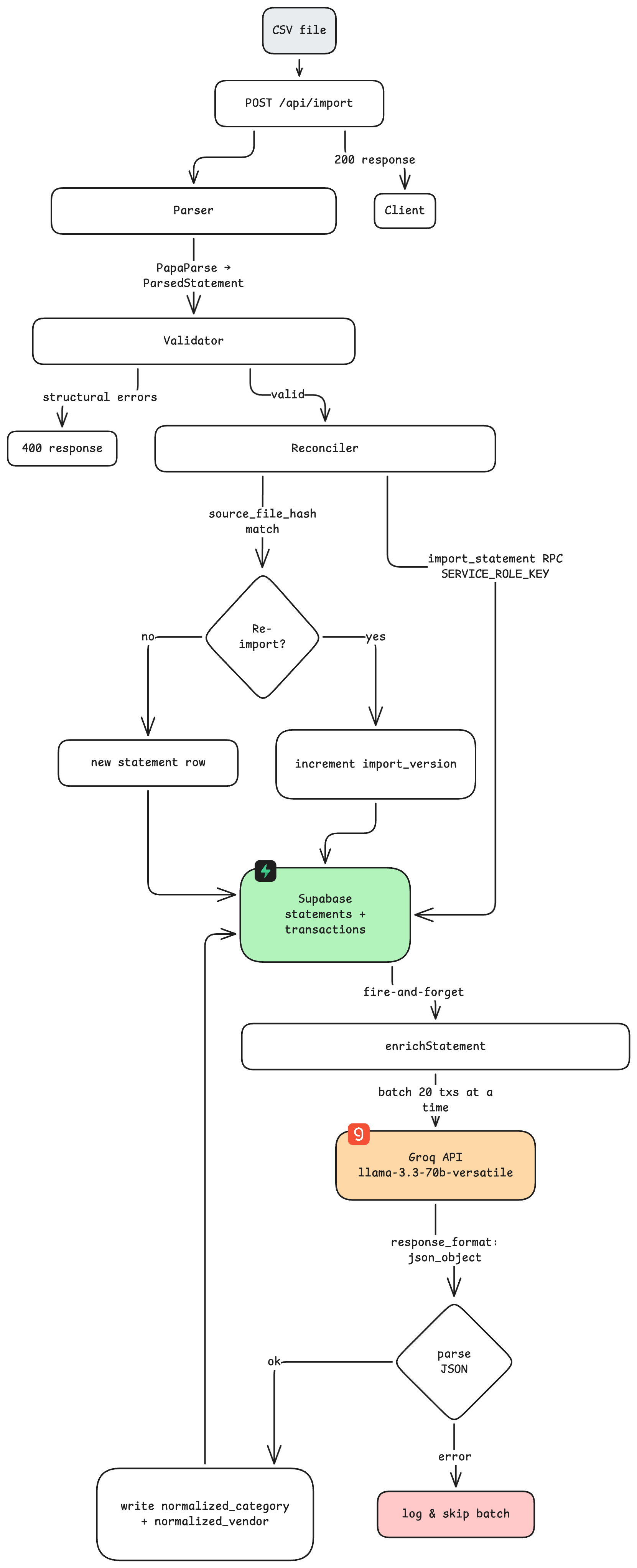
Each import fires a batch enrichment job that classifies transactions into 29 MECE categories — designed specifically for Brazilian condominium accounting — and extracts a normalized vendor name for each transaction.
In practice, the enrichment is invisible to end users: they always see clean categories from the moment they open a statement.
Built for teams
CondoVis is multi-user by design. Building managers and accountants hold admin access — they can import statements, trigger enrichment, and annotate individual transactions with notes visible to the whole team.
Committee members and residents receive viewer access, a read-only role that shows all charts and data but hides import controls and sensitive operations. Role permissions are enforced both at the routing layer and at each API endpoint.
Try it yourself
CondoVis is live at condovis.com.br. You can explore the full platform with this demo viewer access:
- Login: viewer@condovis.dev
- Password: viewer123456